My first attempt uses Ted Williams. The red line is his career wOBA, the blue line is the league average wOBA over that period, and the black line shows how he performed over the past 150 games. As the line fades further from black, that means he played fewer of the past 150 games.
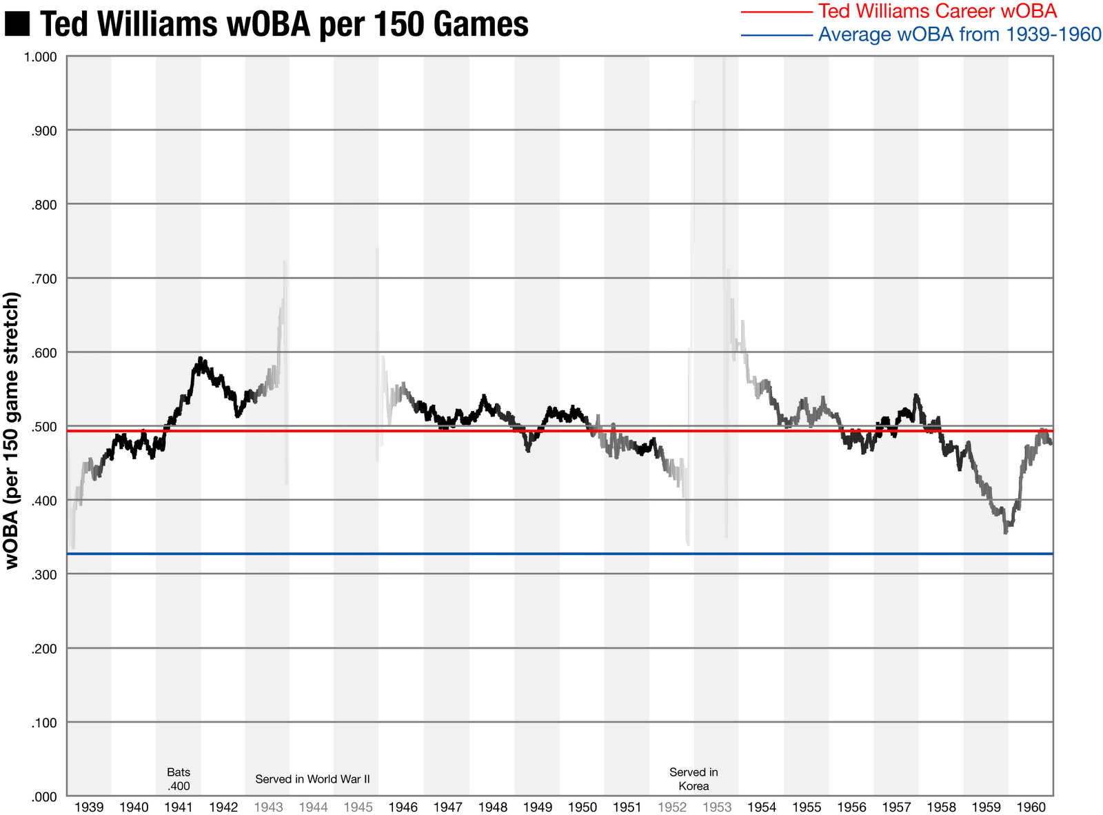
What does this tell us? Well, the darker the line, the more confident we should be that his performance is based on skill, and not just random fluctuations.
In the future I want to use this type of graph to compare multiple players and see what their performance and injury history looks like to give a quick glance evaluation between similar free agents, or trade candidates.
References:
- Raw Data as an Excel Spreadsheet (8.1 MB)
- Ted Williams Game Logs from Baseball Reference
- Ted Williams Career wOBA from Fangraphs
No comments:
Post a Comment